KIRA HEALTH
KIRA: Designing Smart Health for Women
KIRA is a conceptual branding and design project for a tech-driven, AI-powered health platform created to support women in understanding and managing their health. The goal was to develop a strong, empathetic visual identity that reflects the platform’s focus on personalized insights, symptom tracking, and inclusive care.
From logo ideation to a complete brand system, digital marketing materials, and print collateral, this project showcases how thoughtful design can build trust in sensitive, user-focused healthcare technology. With clarity, approachability, and empowerment at its core, KIRA was designed not just to look modern, but to feel human.
Logo Ideation: Hand Sketch Exploration
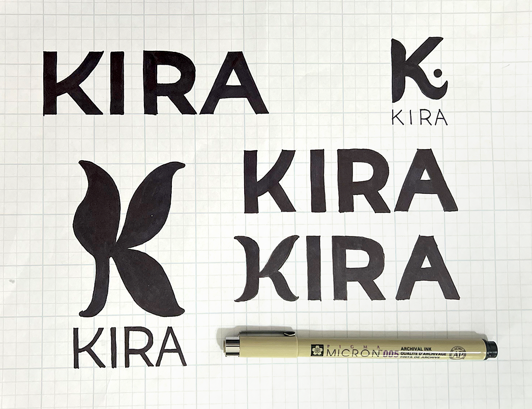
In the early stages of designing the KIRA brand identity, I began with hand-drawn logo explorations to connect more deeply with the company’s core mission: empowering women to better understand and manage their health through AI technology. These sketches reflect thoughtful consideration of KIRA’s purpose: support, care, and conversation. The bold, organic shapes evoke both strength and growth, while the clean typographic treatments aim for clarity and trustworthiness. The inclusion of a stylized leaf-like symbol represents natural wellness and a holistic approach, nodding to the human-centered nature of the platform. This analog process grounded my design thinking in empathy and authenticity, setting a solid foundation for KIRA’s visual identity.
Final Logo Design: Building a Trustworthy & Empowering Visual Identity
The completed KIRA logo system reflects the brand’s core values of care, intelligence, and accessibility. Designed for a tech-forward AI platform dedicated to women’s health, the logo balances modernity with warmth. The main logo combines a bold, custom “K” with a soft dot element, symbolizing both technology and the individual user. The wordmark uses rounded, approachable letterforms to evoke trust and openness, crucial for encouraging conversations around sensitive health topics.
The system includes full color and inverted variations of the main logo, lettermark, and wordmark, ensuring versatility across digital and print applications. The violet and soft blue palette reinforces calm, clarity, and reliability, all essential traits for a health-focused brand. This logo suite not only establishes KIRA as a modern, empathetic tech company but also serves as a visual anchor for its mission: empowering women to better understand and advocate for their health.

Branding Guide : Crafting KIRA’s Visual Language
The KIRA branding guide establishes a cohesive and adaptable visual identity, thoughtfully designed to reflect the brand’s mission: using AI technology to support and empower women in managing their health. The visual system is built around clarity, approachability, and modern professionalism
The color palette features a grounded charcoal primary (#30353c), a confident purple secondary (#6a368e), and supportive blue tones (#39aaf7 and #e2eef5), balancing strength with softness to create a sense of calm technology.
Typography blends the modern geometric feel of NextExit for body and UI content with the expressive elegance of Arima Madurai for emphasis and accents. This pairing creates a visual hierarchy that’s both dynamic and legible, reinforcing KIRA’s dual personality as both empathetic and innovative.
This guide ensures that every touchpoint, from app interfaces to printed materials, communicates KIRA’s brand with clarity, confidence, and care.

Marketing Emails: Bringing the KIRA Brand to Life
KIRA’s marketing emails use clean, solid color backgrounds in purple and blue to create a bold, trustworthy visual presence. The design is minimal yet impactful, using strong typographic hierarchy, custom illustrations, and clear call-to-action buttons to guide the reader.
Each section is thoughtfully structured for readability, balancing informative content with engaging visuals. Branded illustrations and icons support key messages, while the consistent use of color and layout reinforces brand recognition.
The result is a polished, approachable design that reflects KIRA’s commitment to clarity, inclusivity, and empowering women through accessible health tech.


Marketing Brochure : Empowering First Impressions Through Print
This KIRA brochure brings the brand’s visual identity to life through a bold, engaging print design. Using vibrant brand colors, rounded shapes, and clean typography, the layout feels both modern and approachable, mirroring the platform’s purpose of making women’s health feel less overwhelming and more empowering.
The cover features a strong logo presence and a friendly image, while interior pages balance informative content with playful composition. Key features are highlighted with pill-shaped icons, and strategic use of white space keeps the layout clear and digestible. A QR code bridges print and digital, creating a seamless call to action.
Overall, the design reflects KIRA’s core values: clarity, compassion, and confidence - turning health education into an inviting visual experience.


Marketing Roll-Up Banners: Bold, Informative, and Brand-Forward
KIRA’s roll-up banners are designed for maximum impact in event and clinical settings, using bold color blocks, strong hierarchy, and clear messaging to quickly communicate the brand’s value. The use of solid purple and blue reinforces KIRA’s visual identity while maintaining high contrast for readability.
The large logo and tagline at the top immediately establish brand recognition, while the clean, bullet-point format highlights key features like AI-powered tracking and doctor-ready summaries. Abstract shapes and dotted textures add energy and structure without overwhelming the content.
These banners effectively balance clarity and visual interest—making KIRA’s presence memorable, professional, and purpose-driven.

Expanding the Scope of Inclusive Health Design
The KIRA project set out to create a brand and visual identity for a health-focused AI platform designed to support women in tracking, understanding, and managing their unique health needs. Through a cohesive system of logos, branding guidelines, digital communication, and print collateral, the design successfully conveys KIRA’s mission: to provide clarity, empowerment, and accessibility in a space where too often women are overlooked
However, as with any healthcare solution, true inclusivity requires ongoing reflection and adaptation. While KIRA was initially designed with cisgender women in mind, it’s critical to recognize that not all people who menstruate or experience gynecological symptoms identify as women. Trans men, nonbinary individuals, and other gender-diverse people often face even greater barriers to care and visibility.
The design challenge going forward is to expand the brand’s inclusivity in both language and visuals—without losing the focus on personalized, gender-aware health tracking. Future design considerations may include:
Gender-neutral terminology in app copy, onboarding flows, and educational materials
More diverse, inclusive illustrations and imagery representing trans and nonbinary people
Optional personalization in the user experience that reflects identity, pronouns, and anatomy-specific tracking
Thoughtful UX language that affirms all users while acknowledging how sex-specific data is used
KIRA’s foundation is strong—but like the best tools in health tech, it must evolve alongside the people it serves. With intentional, inclusive design, KIRA can continue its mission while ensuring no one feels left out of the conversation about their own body.